Let's All Go To Oregano's

Case Study: Let’s All Go To Oregano’s

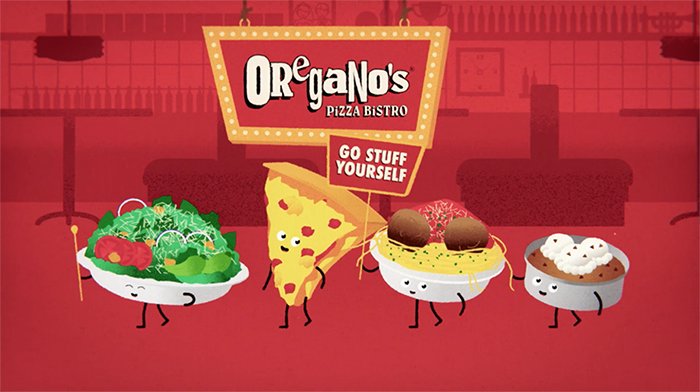
Back in 2018, as part of a greater branding campaign for our client, Oregano’s Pizza Bistro, the team at Anderson and I were tasked with creating a short :30 commercial that would get butts out of movie theater seats and into restaurant booths.

We created this short :30 commercial to be played in movie theater pre-shows. Oregano’s is known for their casual, sassy marketing tone, and we continued that tradition by whipping something up to upset and disgust just the right amount of people, while also serving strategic goals of branding Oregano’s as a fun, casual restaurant with large, delicious portion sizes.

Parodying the endlessly parodied “Let’s all go to the lobby”, this project began as a more direct homage to the source material, complete with mid-century nuclear family and all. Check out our very first sketch animatic to see where we started:

The team wasn’t satisfied with the direction at this stage, so we decided to take it to a place the audience wouldn’t expect.

Or maybe even want.

Oregano’s is also known for their generous portion sizes, so a joke about the pasta’s “weight” was a fun direction to take it in. Who doesn’t shaming a bowl of carbs, right? From there, the meatball pizza joke came naturally as the perfect, uncomfortable ending no one asked for.

The characters were designed in Illustrator, imported into After Effects, and rigged using Rubber Hose and Duik. The final look was created by shifting the R, G, and B channels on to separate layers, using Roughen Edges, Posterize Time (to convert to 12fps), and by using Red Giant’s MisFire and Magic Bullet plugins. Here’s a screenshot of some of those settings:

All in all, it was a huge hit. The client loved it, the team was proud of it, we placed it in movie theaters, and we’ve submitted it for a few awards. Stay tuned for an update, I’ll be sure to brag about it if it wins anything.

Client: Oregano’s Pizza Bistro
Motion Designer: Justin Gagen (me)
Creative Director: Aaron Castiglione
Copywriter and Voice: Arlyn Stotts
Designer & Illustrator: Dustin Perotti
Sound design: AMP Studios

illusionoflife

Tutorial: 12 Principles of Animation + Bouncing Ball Tutorial in After Effects
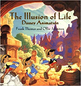
The 12 Principles of Animation, as penned by Frank Thomas and Ollie Johnston in their timeless book, “The Illusion of Life”, are cornerstones of any animator’s skill set. Originally written for use in Disney’s earlier cell-animation days, the principles survive even in today’s landscape of 3D, puppet rigs, motion graphics, and all other computer aided animation.

During my short stint as an adjunct professor teaching motion graphics, I created this video tutorial to summarize the 12 Principles to my students. I also demonstrate some of the principles through a simple bouncing ball tutorial, which you can follow along with. This video was created for beginners, but if you’re an experienced motion designer that hasn’t grappled with the 12 Principles yet, this would be a great jumping off point.

In this video, I create a bouncing ball animation from scratch, testing and adjusting the animation as I go. I mumble a lot as I fiddle with the details, haha, but you get a behind the scenes look at the actual animation process, instead of a step by step recipe like many tutorials. Let me know if you like this “Straight Ahead” type of tutorial, or prefer a more formal “Pose-to-Pose” type structure.

Download the After Effects project and follow along here:
https://www.dropbox.com/s/02o6tdz6vdq5bgo/Bouncing%20Ball.aep?dl=0

Here is a short summary the 12 Principles of Animation:

Squash and Stretch

Squash and stretch gives the sense of mass to an object. The world is not made of solid wood, but also soft, squishy, and jiggly things as well. The bouncing ball is a great example of this in action.

Anticipation

Anticipation prepares an audience for an upcoming action. Consider a golfer winding up to swing his club. The wind up prepares the audience for the primary action.

Staging

Similar to staging in theater, this principle’s purpose is to make “the presentation of any idea so that it is completely and unmistakably clear”, according to Johnston and Thomas. In other words, compose your scene so that your audience can easily focus on what you’re trying to show them.

Straight Ahead and Pose-to-Pose

These are two different approaches to creating an animated sequence. Straight ahead is the method of drawing an animated sequence starting from frame 1, and drawing each frame sequentially until you reach the end. Pose-to-Pose is the method of creating key drawings to time out a scene, then drawing the in-between’s to fill in the rest.

Each method has its own characteristics. Straight Ahead tends to create more fluid and dynamic animations, and Pose-to-Pose offers more control over timing and spacing. A combination is often used in every production.

Pose-to-Pose will be more familiar to computer artists, who are used to setting keyframes in After Effects or Cinema 4D while the software creates the in-between’s for you. Keeping the two methods in mind may help you approach a challenging animation by thinking of it differently, even though they were primarily conceived for drawing animation.

Follow Through and Overlapping Action

These closely related techniques help create more realistic movement by adjusting the timing and inertia of mass attached to the primary action. “Follow Through” means parts of the body should continue moving even though the character may have stopped, like hair or jewelery. “Overlapping Action” is the tendency of body parts to move at different rates. A character’s arms may not swing at the exact time they take a step, for example.

Slow-In and Slow-Out

When you’re driving a car, and you press the gas pedal, do you go from 0-60 in a tenth of a second? Just like in a car, animated objects take time to speed up and slow down. In After Effects, changing a linear keyframe to an easy-ease is a basic example of this in action.

Arc

Natural movement doesn’t tend to move in straight lines, but rather in arcs. Unless you’re animating a machine, try to give a little arc to your movements to give a bit of new energy to them.

Secondary Action

A Secondary Action is a movement that helps support the main action. For example, a character may be walking down a street, and the secondary action could be them using a yo-yo. The main point of a Secondary Action is to add more details in order to support the main action. If they distract from the main action, they are better left out.

Timing

Timing is the numbers of drawings (or frames) between two key poses. On a basic level, fewer frames creates a faster action, and more frames creates a slower one.

Exaggeration

Animated motion has a strange tendency to look slow or dull if drawn true to life. Exaggeration is used to present a “wilder, more extreme” form of reality to the viewer.

Solid Drawing

Animators also need to be skilled artists. The principle of Solid Drawing means taking into account 3D space when illustrating and animating a scene. For classical animators, this means becoming skilled at life drawing and perspective, in order to prevent shapes from morphing and sliding mid-animation. For 3D and other computer animators, strong art foundations are still important, but less critical.

Appeal

Actors have charisma, and animations have Appeal. The design of a character should be interesting for the audience to look at.

I’ve only summarized and paraphrased what Frank and Ollie have said in their book, and I highly recommend it to anyone with an interest in animation. Besides the 12 Principles, there’s a plethora of good advice and interesting history of Disney Animation. Here’s where to buy it on Amazon.